Flexbox in CSS

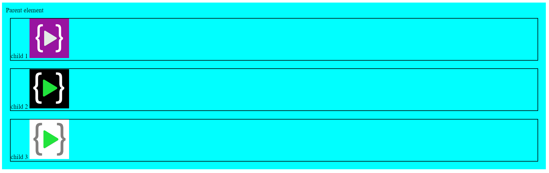
Before starting with Flexbox we must be familiar with the Parent-Child relationship in HTML elements. So, when one or more elements are declared inside an element then the outer element is called the Parent element, and all the elements inside the parent element are called its children. Let's understand this with one example,
<!-- Parent Element-->
    <div class="parent">
        Parent element
        <!-- Child Element-->
        <div class="child">
            child 1
            <img src="./assets/lco_img1.png" alt="image not available">
        </div>
        <!-- Child Element-->
        <div class="child">
            child 2
            <img src="./assets/lco_img2.png" alt="image not available">
        </div>
        <!-- Child Element-->
        <div class="child">
            child 3
            <img src="./assets/lco_img3.png" alt="image not available">
        </div>
    </div>
.parent{
    background-color: #00FFFF;
    padding: 10px;
}
img{
    width: 50px;
    height: 50px;
}

Flexbox Properties
Display
Flex
Setting element display property as Flex (to parent element), set its children in Flex layout.
display: flex; /* Enables flex for all children. */
Flex direction
flex-direction set the direction of the main axis.
Full CSS
.parent{
    background-color: #00FFFF;
    padding: 10px;
    display: flex;
    flex-direction: row / column / row-reverse / column-reverse;
}
.child{
    border: 2px solid black;
    margin: 10px;
}
img{
    width: 100px;
    height: 100px;
}
Row
Syntax
flex-direction: row;
Output

Column
flex-direction: column;
Output
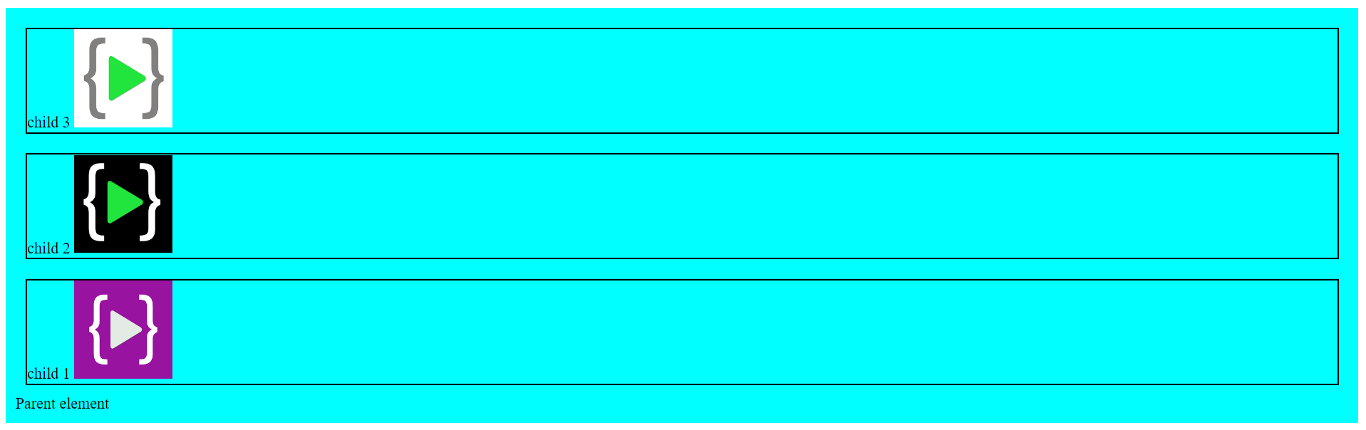
Row reverse
Syntax
flex-direction: row-reverse;
Output

Column reverse
Syntax
flex-direction: column-reverse;
Output
Justify content
Attempts to distribute extra space on the main axis.
Flex start
Syntax
justify-content: flex-start;
Output

Flex end
Syntax
justify-content: flex-end;
Output

Center
Syntax
justify-content: center;
Output

Space-between
Syntax
justify-content: space-between;
Output

Space around
Syntax
justify-content: space-around;
Output

Space evenly
Syntax
justify-content: space-evenly;
Output

Align Items
Determines how items are laid out on the cross axis.
Flex start
Syntax
align-items: flex-start;
Output

Flex end
Syntax
align-items: flex-end;
Output

Center
Syntax
align-items: flex-center;
Output

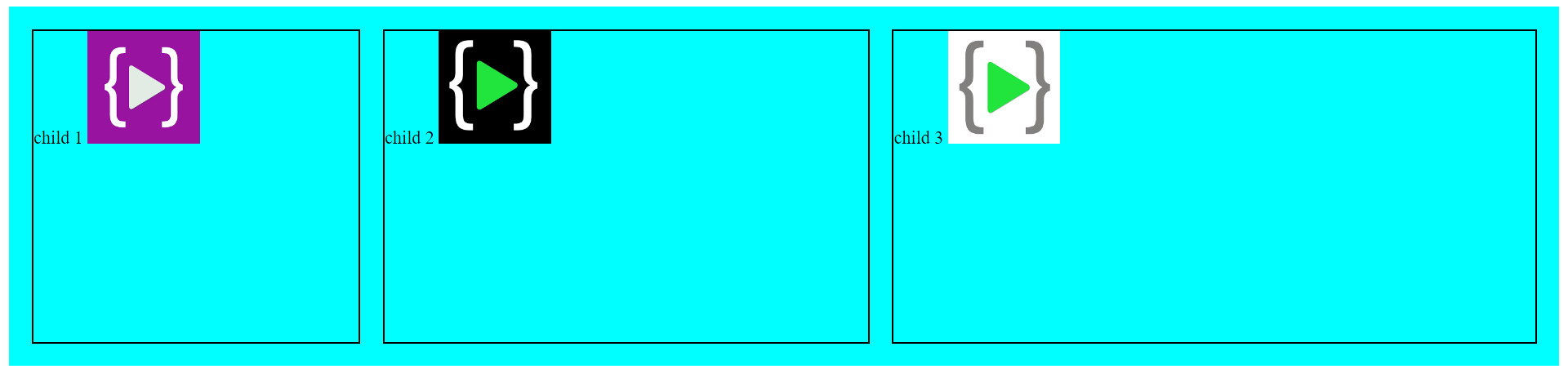
Flex grow
Allows determining how each child is allowed to grow as a part of a whole. Syntax
.child1{
    flex-grow: 1;
}
.child2{
    flex-grow: 2;
}
.child3{
    flex-grow: 3;
}
Output
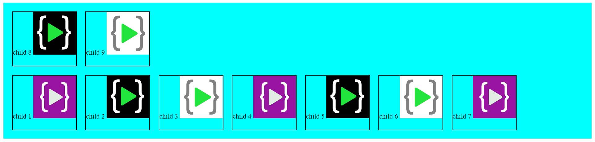
Flex wrap
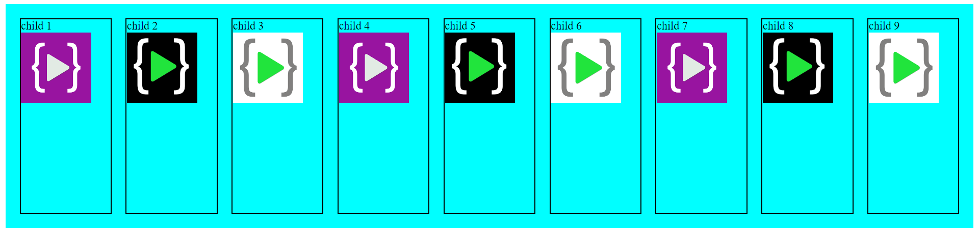
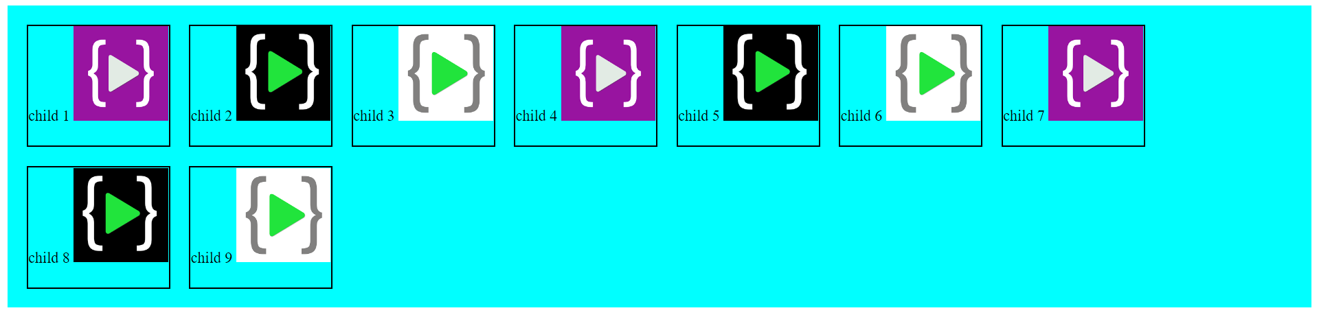
Wraps items if they can't all be made to fit on one line.
No Wrap
Syntax
flex-wrap: nowrap;
Output
Wrap
Syntax
flex-wrap: wrap;
Output
Wrap reverse
Syntax
flex-wrap: wrap-reverse;
Output